Power BI, Tableau and Cognos Analytics all provide BI dashboard capabilities, but how do they compare? Is one better than the other for specific business requirements? Or are the differences more about personal preference?
In this blog we look at the differences between the three tools, working through some how-to steps for each that will highlight their various approaches. We discuss the ins and outs of building a dashboard in each product, how to distribute the dashboard and some factors to consider when deciding which tool to use.
What is a BI dashboard – and what is not?
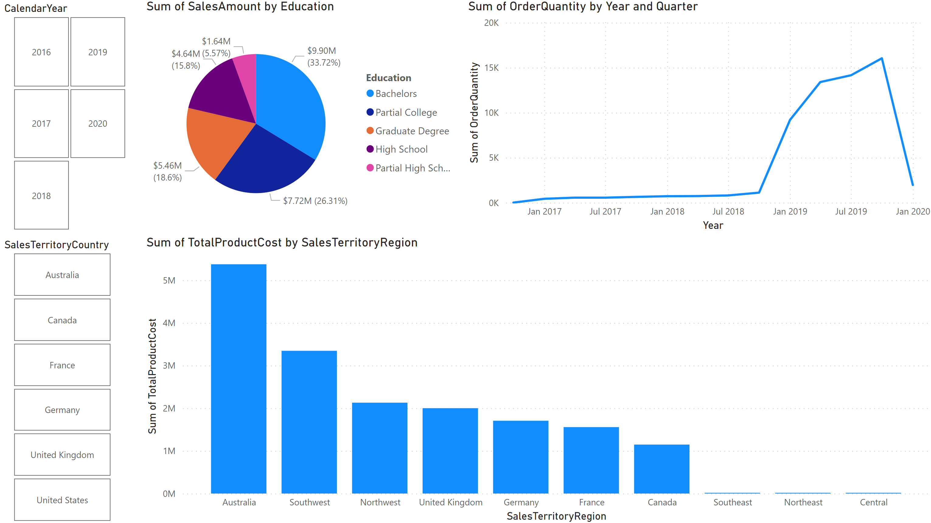
Most people think of a dashboard as a collection of objects on a page. Perhaps it looks something like this:
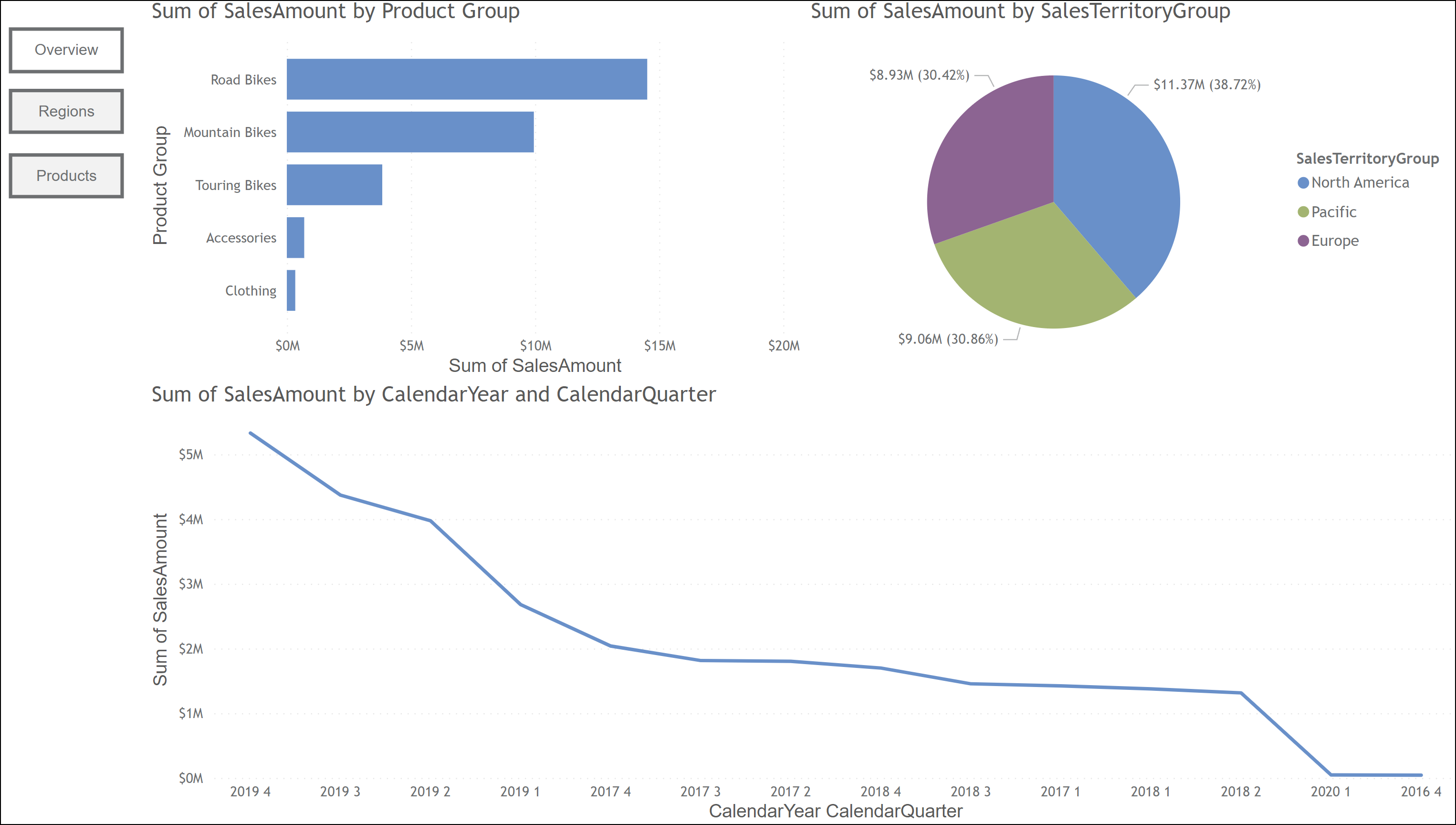
Ah, but is this a true dashboard by the technical definition? No, it is not. What we see in this example is actually a “dashboard style” report.
To most users, this distinction is lost, or even irrelevant. After all, this report is serving its purpose: it is a collection of objects providing interaction, displayed at a summary level, allowing for drill down to detailed information. Sure sounds like a dashboard, right?
In most cases, the difference with this dashboard style report and a true dashboard comes from the ability to display data from unrelated, disconnected data sources across multiple pages. This multiple-data-source distinction is the key to the definition of a dashboard.
Taking it one step further, for some tools, a dashboard can be collections of objects from different source reports, with different data sources, and with completely different back-end technologies. For example, you could create a dashboard using objects taken from a report created by a colleague, and that dashboard might have data coming from Oracle, SQL and an Excel file all at the same time.
Keeping in mind what differentiates a “dashboard” from a “dashboard style” report, let’s look at how Power BI, Cognos and Tableau approach the creation of a BI dashboard.
Regardless of the dashboard tool, the end goal is generally the same: to provide a conduit for sharing data across the enterprise in a concise, easy to read and understandable format. Power BI, Tableau and Cognos all offer the same basic features in terms of visualizations, filtering and multiple pages. The nuance lies in how this information gets built and distributed in each tool.
Power BI
To make dashboards in Power BI requires using multiple tools: Power BI Desktop, Power Query Editor and the Power BI service.
Let’s start first with Power BI Desktop, where we will build our primary report and pages.
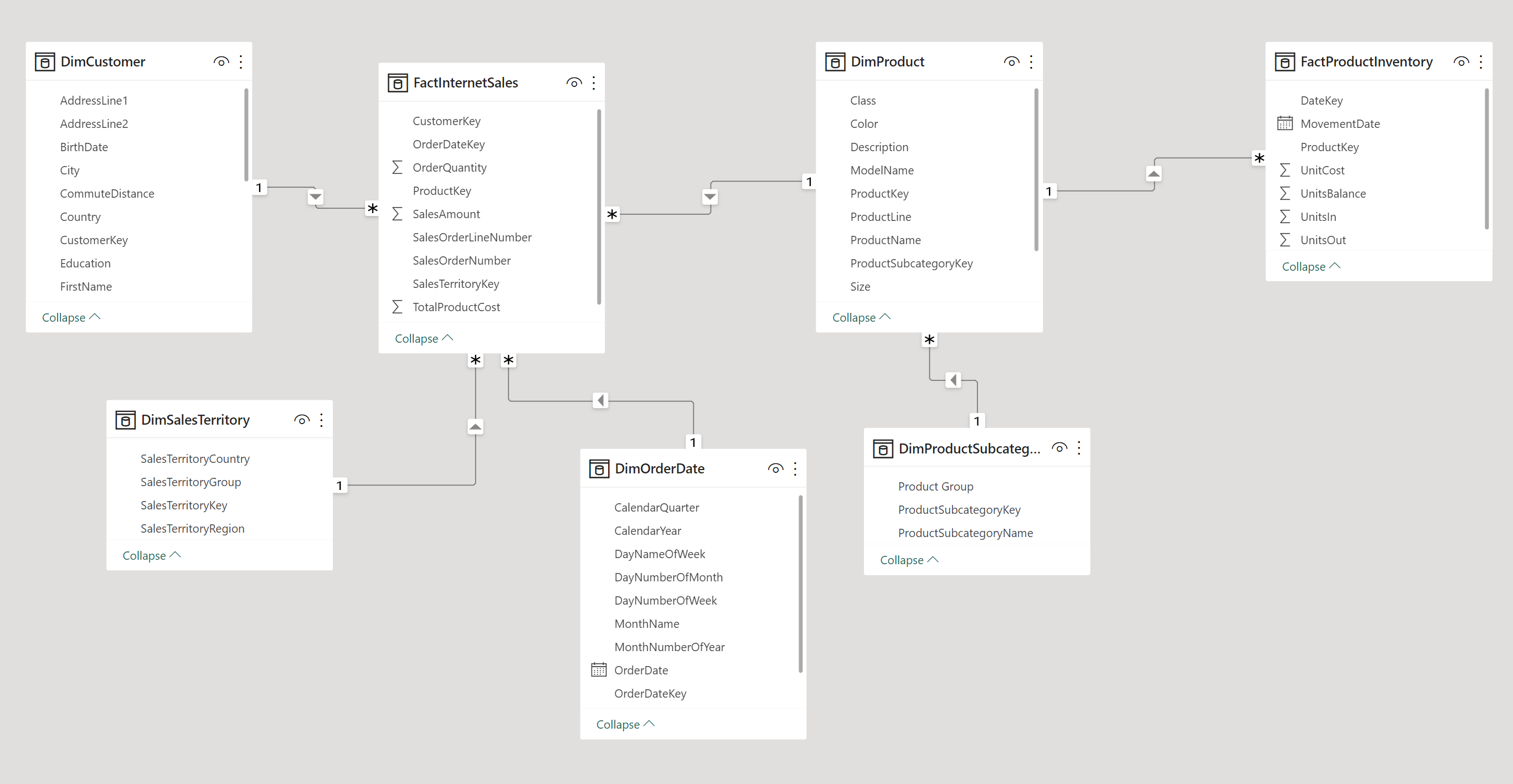
Begin by opening your local copy of Power BI Desktop. Bring in data from any source you want.
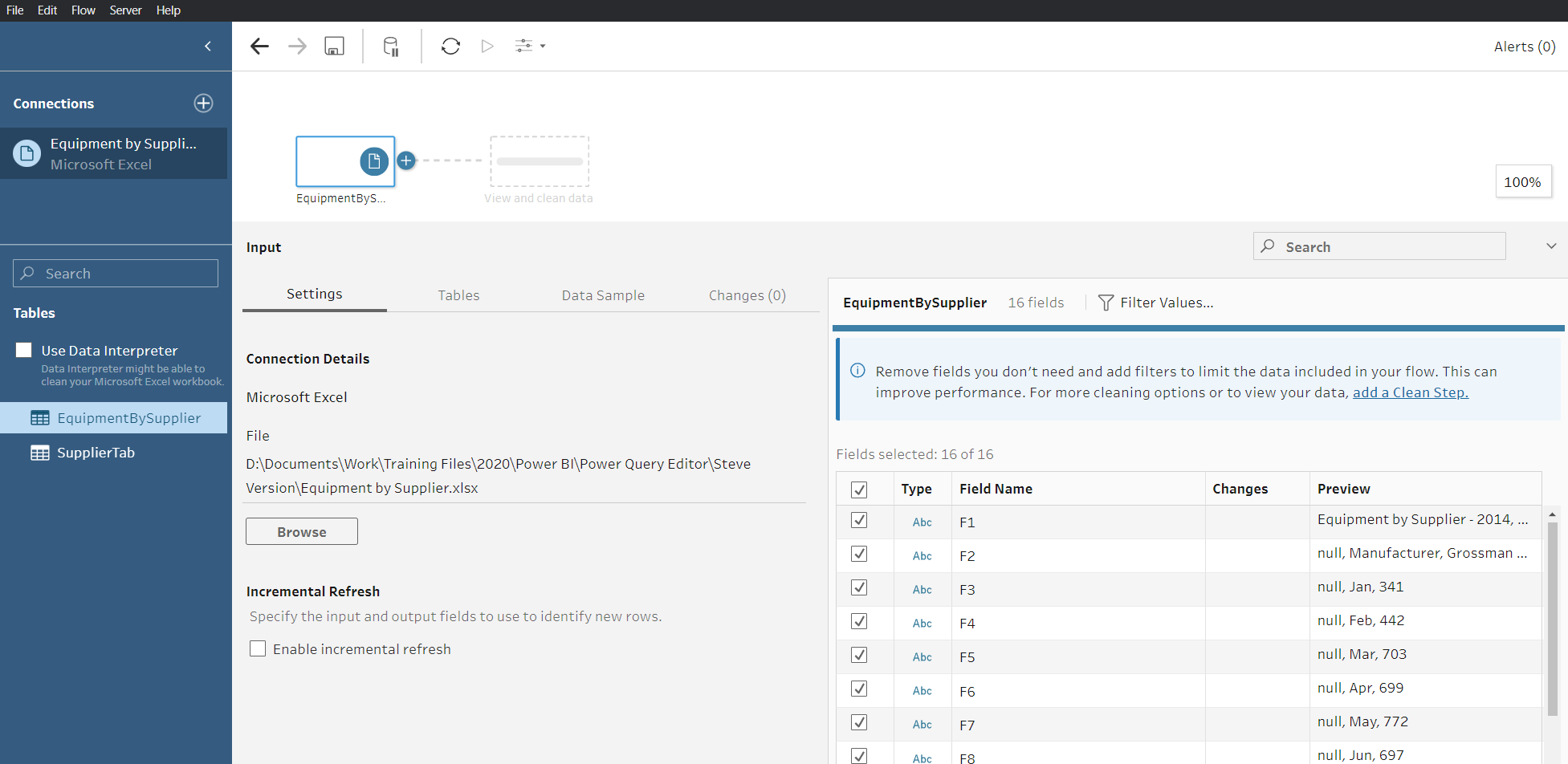
For our example we will use a data source from Excel for the primary page. Here’s how the source file looks in Excel:

As we can see, this file isn’t ready to be used for reporting.
Our next step to building a Power BI dashboard is to use Power Query Editor to cleanse and modify the data for use later. Once the data is ready to go, we will return to Power BI Desktop. To be safe, check the modeling tab to make sure all our joins are correct before proceeding any further.
After we’ve confirmed our joins and everything looks good, we can build our report pages.
For this step, we’re still using Power BI Desktop and returning to the report page. Here we will bring multiple visuals onto the page, arrange them as desired, and add slicers as needed for interactivity. Voila! Here is our ready-to-go “dashboard style” report:
But wait! This dashboard is *local,* i.e. for us only. To make it a true enterprise dashboard, we need to share it. We could send someone the PBIX file, but that would assume they have a local copy of Power BI. Not to mention with a PBIX file and a local copy of Power BI, they would have the ability to change or modify the workbook!
We need to publish this dashboard to make it available to the world. Before we do that, we’re going to add a second page. This is where a real dashboard comes in. Our second page is from an unrelated data source. We can connect to our SQL inventory system and build a new page in the same workbook.
The data for these two pages doesn’t have to be linked in any way. With our second page, we would now publish this to our Power BI portal:
After it is in a workspace, we can turn it into a dashboard that can be mass distributed.
To do so, log into our Power BI portal page and find the report we just published.
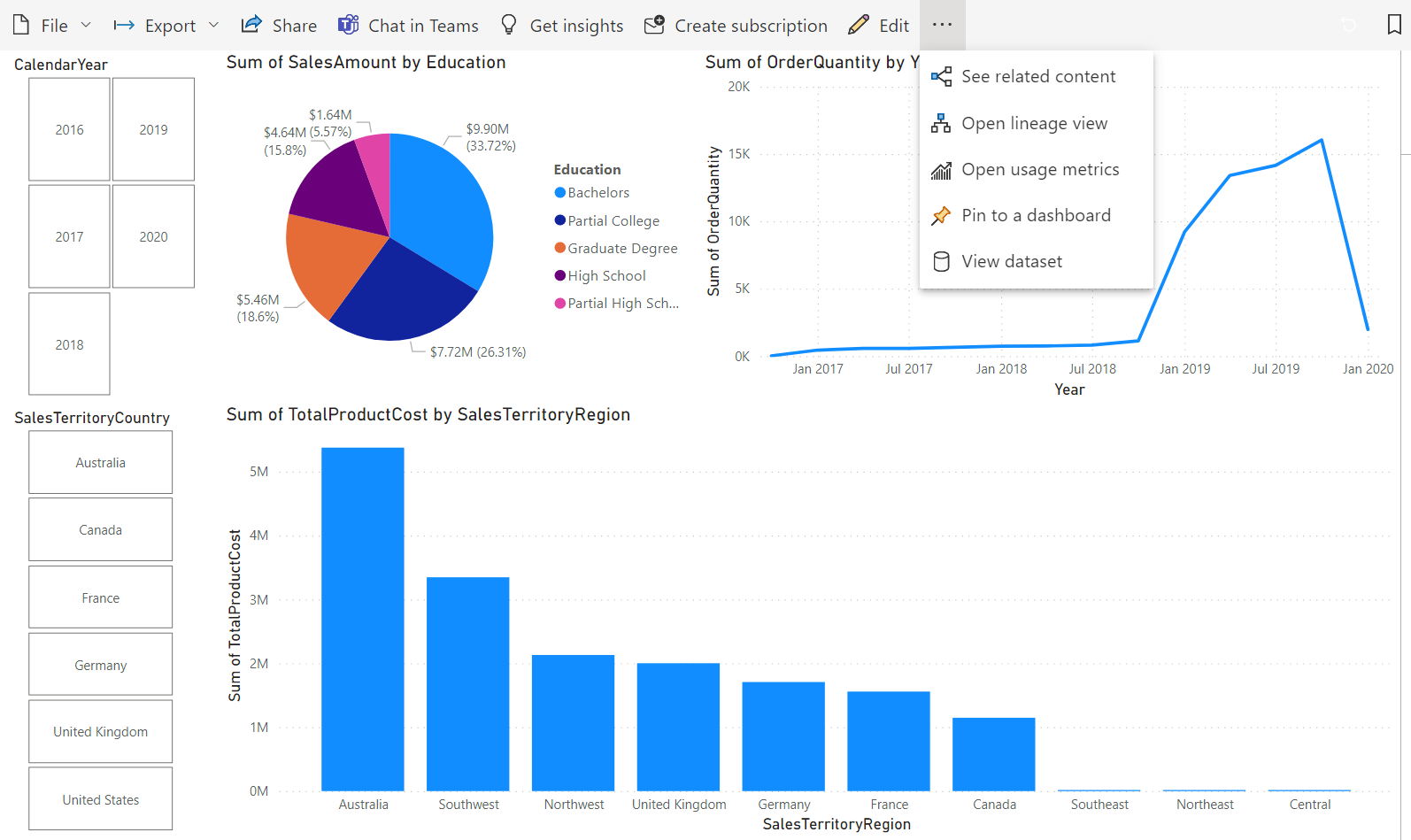
We can pin this entire page to a dashboard from the options at the top or we can pin an individual object. If we want to use all the functionality, in this case the slicers, we will need to pin the whole page.
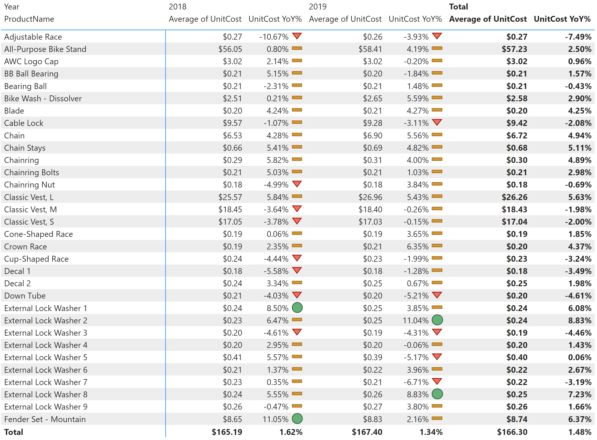
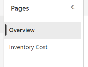
Note that each page is unique. We have a page for our Overview and a page for our Inventory Cost.
We will need to pin the Overview page on its own. Once the pages have been pinned and added to a single dashboard, we see a new entry in our portal:
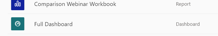
Here’s our two different pages in a single dashboard.
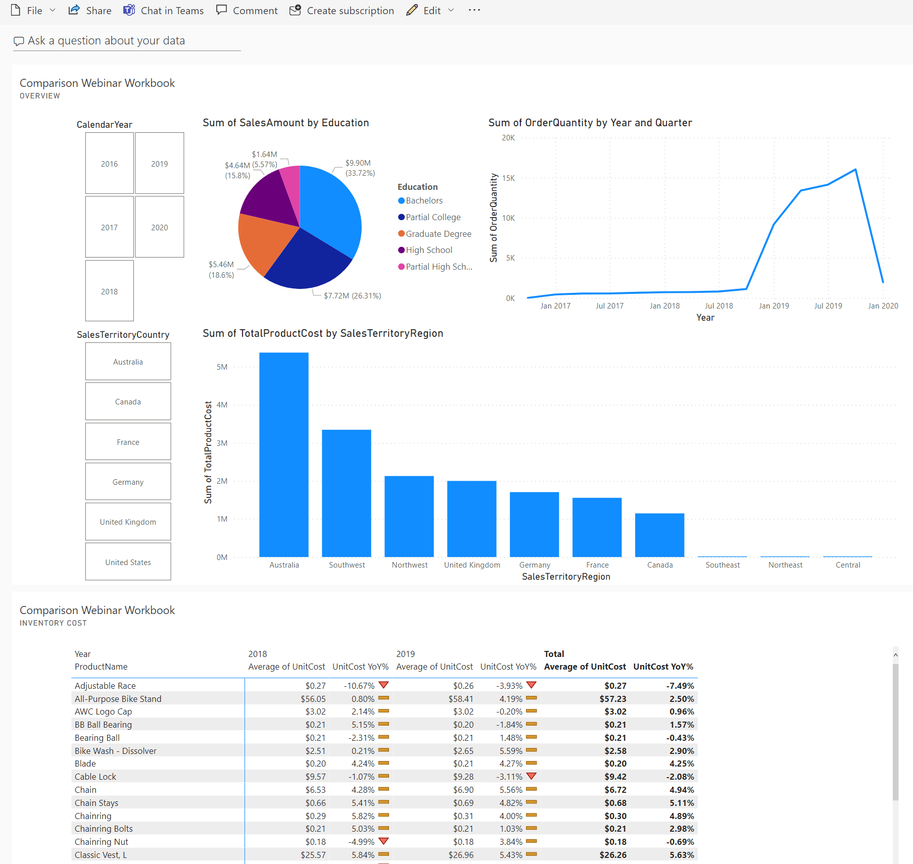
The key to the layout is that the items we pinned didn’t have to come from the same report! We could have pinned objects from any number of reports, pages on those reports, individual objects—whatever we wanted—and created this final dashboard. Any formatting we want to do to this dashboard would be done beforehand, at the report level. A dashboard here is just the final pinned objects. Size changes, fonts, background colors – all that would have been done before, in Power BI Desktop. Now that it is ready to go, we can deploy this to a public area, endorse it to make sure it gets the visibility we need and our Power BI dashboard is done.
Cognos
Cognos only requires using one tool to build a dashboard. Because all of Cognos is online, we only need to log into our main portal to build our dashboards.
We will start with an XLS file for our data source, so the first step will be to create a data module. Again, we do this to allow us to clean our data, check for joins and make sure it is report ready.
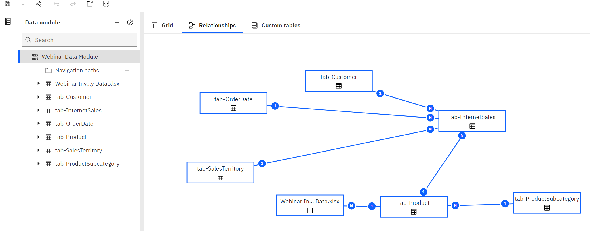
With our data ready to go, we’re now set to build out our “dashboard style” report. Like Power BI, if we had another data source from an independent system, we would need to build a data module for that source as well.
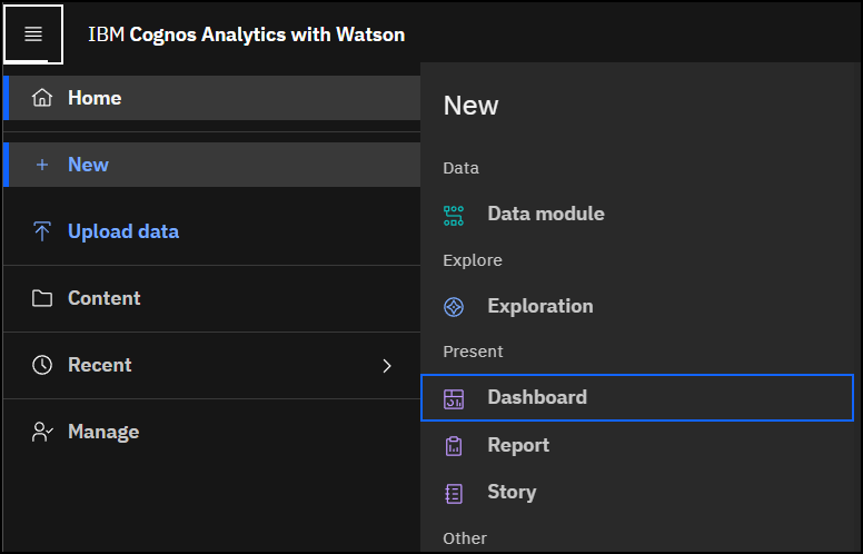
We build our dashboard by going to our main portal page, clicking New, and selecting Dashboard.
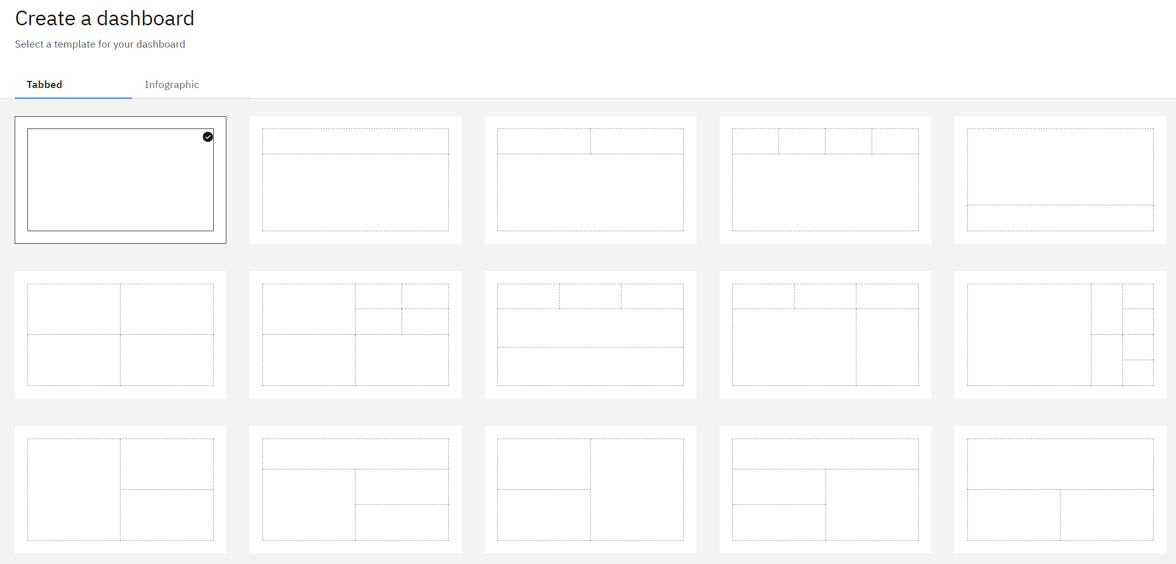
First up, we need to pick a layout. See below. We can free-form it by choosing the first option, or use one of the template layouts.
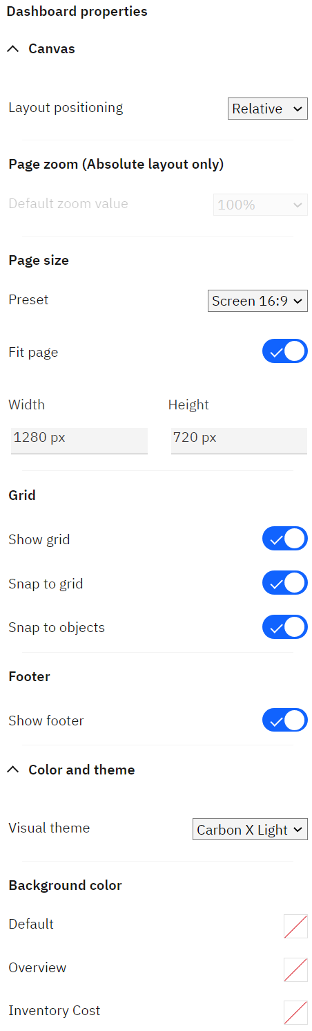
In Cognos, dashboards are built out in real time. That is a one big difference from Power BI. Formatting, including fit to page, is done right here in the dashboard tool.
After we have the widgets in place, data assigned and have formatted to our liking, our dashboard is ready to go. If we want to create a second page, we can do so by adding more tabs at the top.
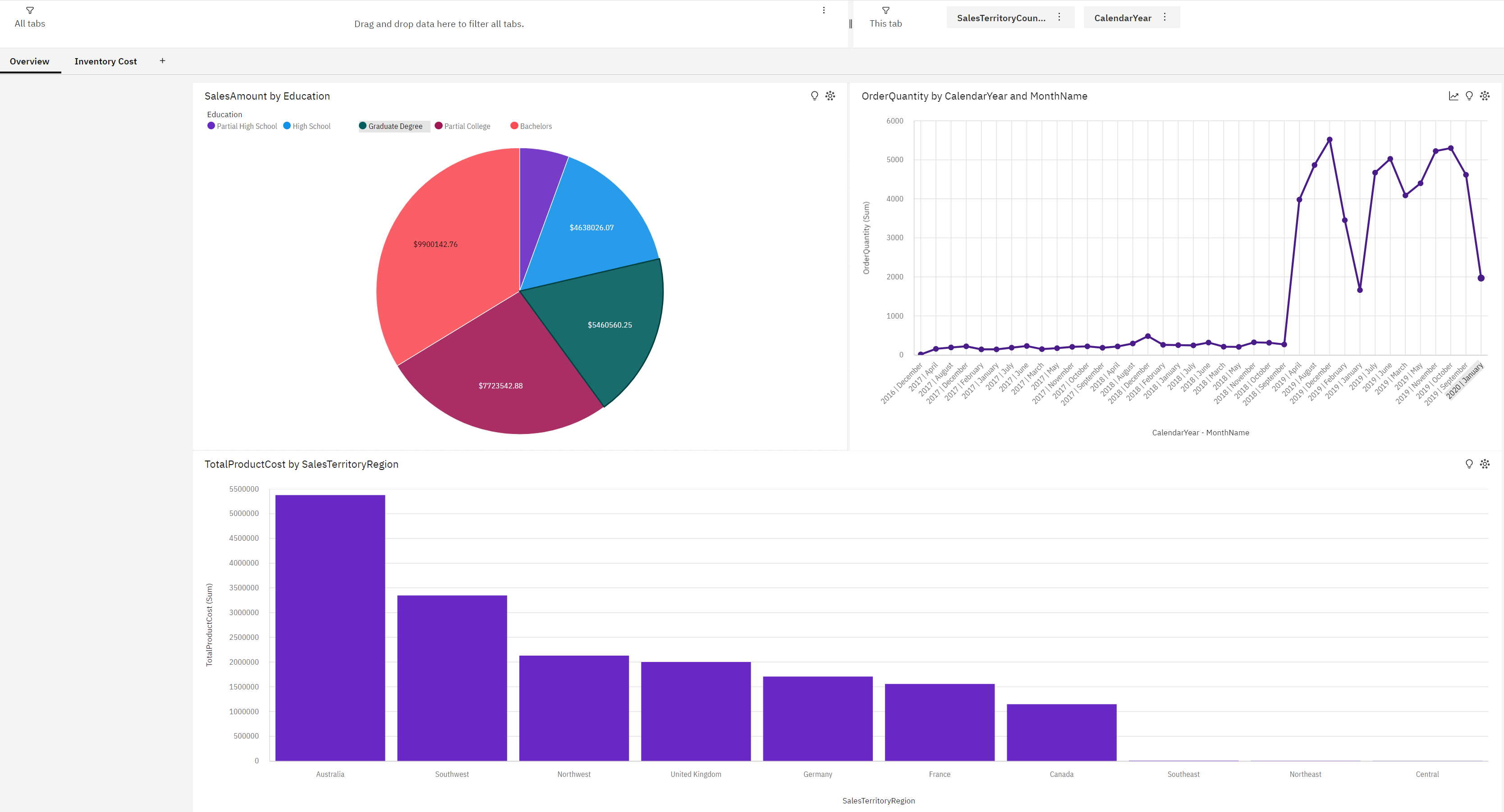
Note: In Power BI the pinned objects were stacked. In Cognos, each page is separate and can have its own filters, distinct formatting and, most important, its own data source. All that’s needed from us is to place the final dashboard in a public folder for consumption.
Tableau
Tableau behaves like Power BI and requires using two tools to create a dashboard: Tableau Prep and Tableau Desktop. If we use the same data sources as we used before, our first step is to bring them into Tableau Prep Builder for cleansing. Just like we did with Power BI, we can delete columns, create new columns, merge fields together, etc. This step will get our data report ready.
Note: Unlike Power Query Editor, which is built into Power BI Desktop, Tableau Prep is a separate product. Tableau Prep requires a distinct install, and you may have to check with your administrator to have it installed. It is included in the license for Tableau Desktop, but access will depend on your organization’s rules.
After our data is clean, we can open Tableau Desktop and build our reports. Just like with Power BI, each report will have its own worksheet. Also, each worksheet can come from its own separate data source.
Let’s look closer at that distinction; we can only have one visualization per page. This is a big difference. If our dashboard is going to have five or six objects, then we will have five or six worksheets each consisting of one widget.

With the two worksheets ready, we now move to our dashboard. Here we stay in Tableau Desktop and click on the New Dashboard button (similar to Cognos.)
As we can see on the left, all our individual worksheets are available for us to bring over and lay out on the dashboard canvas.

When it comes to formatting, Tableau acts as a bit of hybrid between Cognos and Power BI. We can do dashboard-specific formatting such as titles, colors, etc. or we can modify each worksheet individually.
Regardless of how we choose to format, after we’re ready, we have to publish our dashboard to share it (same as with as Power BI). To publish, look on the ribbon for the Share Workbook With Others button. Provide the URL, any security and our new dashboard is now ready to be consumed within the organization.
Conclusion
As we’ve seen, all three tools share some commonalities and the ability to build and distribute data in a concise, easy to digest and visual format. All three tools provide the ability to create dashboards from multiple sources, be it from a database, a flat file or a combination of types. All three allow filtering, interactivity for users and presenting insights in an engaging format.
Ultimately, the decision which tool to choose boils down to your preferences and environment. Power BI and Tableau require desktop tool installations, maintenance and updates along with a server component that needs to be administered. Cognos provides everything in one fully web-based package. But Cognos doesn’t offer some of the flexibility for data transformation or DAX customization you get with Power BI. Alternately, Power BI doesn’t provide the clean, easy-to-use interface that comes with Tableau.
You will need to think about your users, your developers, your infrastructure and your budget to truly decide which tool fits your organization’s needs.
For more on this topic, check out our detailed breakdown of all three tools. It goes beyond the single function of dashboarding and looks at more than 150 different characteristics in each product. It is an excellent resource to help you determine the right tool. If you need help parsing out and weighing the decisions and need to understand our reasoning behind each rating, we are happy to speak with you.