Scenario:
We usually use pie charts to visualize data in our Tableau charts, but my boss would like to use a donut chart instead. How can I do that?
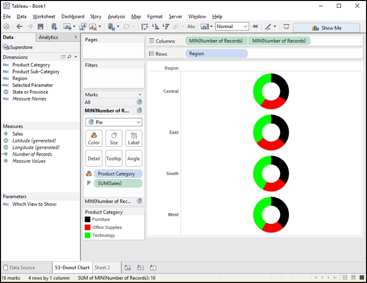
Solution:
- Hold down the Control key and select two dimensions and one measure. For the Tableau supplied SuperStore data, select Sales, Region, Product Category.
- Using Showme, select PIE chart.
- Right click [Number of Records] and drag to Columns shelf, selecting the MIN() value. Do the same action, a second time.
- From the Marks card, click on the bottom MIN(Number of Records) value (to allow size color changes for the second set of pies).
- Drag Product Category off the color area of the Marks card.
- Drag SUM(Sales) off the size area of the Marks card.
- Click the Size button and cut the size of the selected pies in half.
- Click the Color button and select white as the color.
- Right click on the right side pill on the Columns shelf and select DUAL AXIS.
The results!

Interested in learning more about Tableau? We have many free resources in our Knowledge Center, including our on-demand webinar: 10 Best Practices for Tableau Dashboard Design.
Need additional Tableau training? We beginning and advanced instructor-led, online courses as well as self-paced, onsite and custom training.
Learn Tableau. Expert instructors. Advanced topics.
 |
This tip is complimentary of Chuck Hooper. Chuck does Tableau consulting and training for Senturus. Chuck’s career includes |