KPI dashboard design and the case for big numbers
The key performance indicator (KPI) dashboard has become a managerial must-have report for assessing business performance. Offering an at-a-glance view of important performance metrics (like sales and profit), this dashboard lets decision makers quickly know if numbers are trending up or down.
As with all visual designs, layout and formatting play an important role in effective communication. The use of “big numbers” in the KPI dashboard layout calls attention to the critical report figures by displaying them in a bigger font so they are clearly visible. Big numbers are usually displayed at the top of the dashboard with their related details below. Ideally, they are also color coded with arrows indicating upward or downward trends.

Given the effectiveness of the big numbers format to quickly convey KPIs, you’d think it would be easy to create this type of dashboard in Tableau. But, to get the formatting just right requires some extra steps. In this blog, we will share one of our tried-and-true methods for creating a professional looking big numbers KPI dashboard. Since sales and profits are the most commonly used KPIs, we’ll create a big numbers dashboard to highlight those, but the principle applies to any important figures you want to surface.
NOTE 1: Our example is built using “Sample – Superstore.xls” (which comes with every release of Tableau).
NOTE 2: Words in yellow highlight indicate items you will need to change when duplicating fields.
Learn Tableau. Expert instructors. Advanced topics.
How to create a sales KPI worksheet using big numbers
Part I – Build a profit worksheet
-
- Create a new workbook. Call it Sales KPI Dashboard.
- Connect to Sample Superstore.xls.
- Drag Orders to where it says drag sheets here.
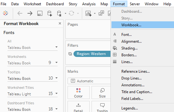
- Optional – Before starting to build worksheets I find it best to do some of the formatting at the workbook level. To be consistent and ensure you don’t have to change every worksheet separately you can use Format Workbook → Font and set it to Tableau Book or Tableau Medium.

- Create a new worksheet. Call it KPI Profit.
NOTE: Before you create your first worksheet, you will need to create the supporting calculated fields. For example: Current Year Indicator, Prior Year Indicator, Sales Current Year (Sales – CY), Sales Last Year (Sales – PY). - Create a calculated field called Current Year Indicator. Create the calculated field as shown below:
YEAR([Order Date])= {FIXED: MAX(YEAR([Order Date]))} - Right click on Current Year Indicator and select Duplicate. Rename the new field Prior Year Indicator.
- Right click on Prior Year Indictor and select Edit. Change the calculation to add the -1 at the end.
YEAR([Order Date])= {FIXED: MAX(YEAR([Order Date]))} – 1 - Create a calculated field called Profit – CY. For this calculation use:IFNULL(If [Current Year Indicator] THEN [Profit] END,0)
- Right click on that field and choose Duplicate. Call the new field Profit – PY. Change the calculation to reference Prior Year Indicator.
IFNULL(If [Prior Year Indicator] THEN [Profit] END,0) - Create a calculated field called Profit – Change $ as follows:
(SUM([Profit – CY])-SUM([Profit – PY])) - Create a calculated Field called Profit – Change % as follows:(SUM([Profit – CY])-SUM([Profit – PY]))/SUM([Profit – PY])
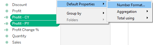
- Control click to select Profit – PY and Profit – CY.Select Default Properties → Number Format. Change it to Currency Custom → decimal places 0 and units Thousands.

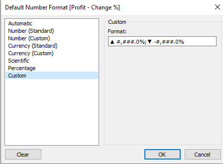
- Right click on Profit – Change %.Change Default Properties – Number Format to Custom.
In the Format: box, use the format string shown below to get up and down arrows (see image).Format: ▲ #,###.0%;▼ -#,###.0%
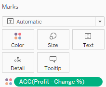
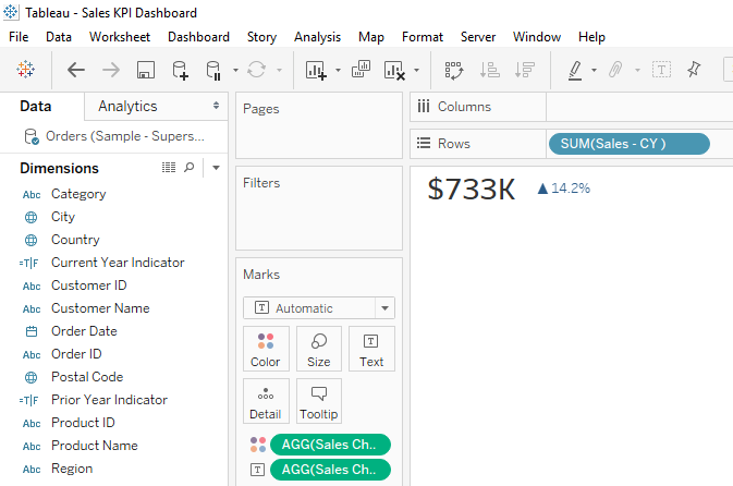
NOTE: You can create custom formats similar to those available in Excel (i.e. if you would like to show change instead of % change, you can choose to have thousands of separators). - Bring Profit CY to Rows.
- On the Rows shelf, right click on SUM(Profit CY) and change it to Discrete.
- Right click on SUM(Profit CY) on the Rows shelf. Choose Format – change it to Tableau Book, size 20.
- Bring Profit – Change % to Text.
- Under your measures, click on Profit – Change %.
Select Default Properties → Color.
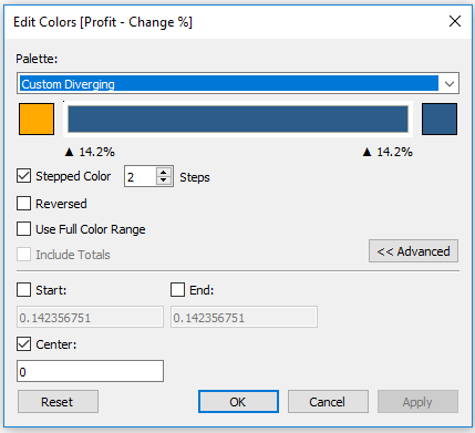
Choose Edit Colors and select the following:- Stepped Color → 2 steps.
- Click on <<Advanced. Change Center to be 0.
- Make it Orange- Blue diverging. Click on Red square. To make it easier on the eyes, change red to orange (see below).

- Bring Profit – Change % to Color on the Marks card.

- On the worksheet, right click on the Profit – CY header and select Hide field label for rows.
- Right click on the worksheet title KPI Profit and select Hide Title.
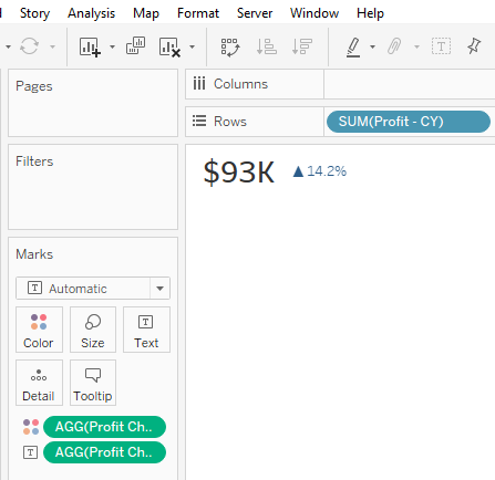
- Click on Format in the top menu. Select Format Borders → Row Divider. Change it to None.Your KPI Profit worksheet should look like this:

Learn how to make dazzling dashboards: watch the video
Part II – build sales worksheet
Now, we need to generate the same calculated fields as we did for Profit but instead, we will reference for Sales. To make this easier, we will duplicate the fields we created for Profit.
-
- Duplicate the fields Profit – CY, Profit – PY, Profit – Change $ and Profit Change %
- Rename the duplicated fields to Sales – PY, Sales – CY, Sales – Change $ and Sales Change %
- Edit each calculation for the new Sales fields changing the fields that reference Profit to reference Sales. See the example below for Sales – CY.
IFNULL(If [Current Year Indicator] THEN [Sales] END,0)
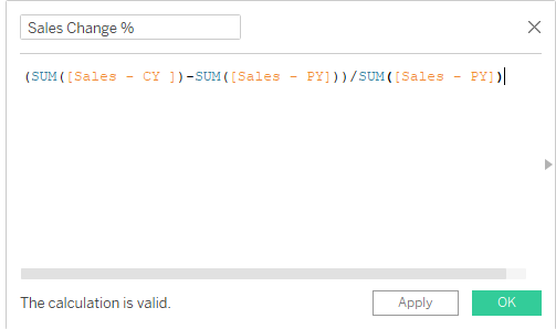
TIP: For Sales Change %, make sure your calculation looks as follows:
- Duplicate the KPI Profit worksheet call your new worksheet KPI Sales.
- Change the fields you have placed on Rows, Text and Color to your new Sales calculations.
- Make sure Sales Change % has the custom formatting ▲ #,###.0%;▼ -#,###.0%.
- Edit colors on Sales Change % like you did in step 17 above.
- Make sure the format on Sales – CY is set to Tableau Book 20.
Your new Worksheet KPI Sales – should look like this:
Part III – build a profit ratio worksheet
-
- Create a new field Profit Ratio – CY. Use the calculation:SUM([Profit – CY])/SUM([Sales – CY])
- Create a new field Profit Ratio – PY. Use the calculation:SUM([Profit – PY])/SUM([Sales – PY])
- Create a new field Profit Ratio Change. Use the following calculation:([Profit Ratio – CY] – [Profit Ratio – PY])
- Duplicate the KPI Profit worksheet.
- Rename it KPI Profit Ratio.
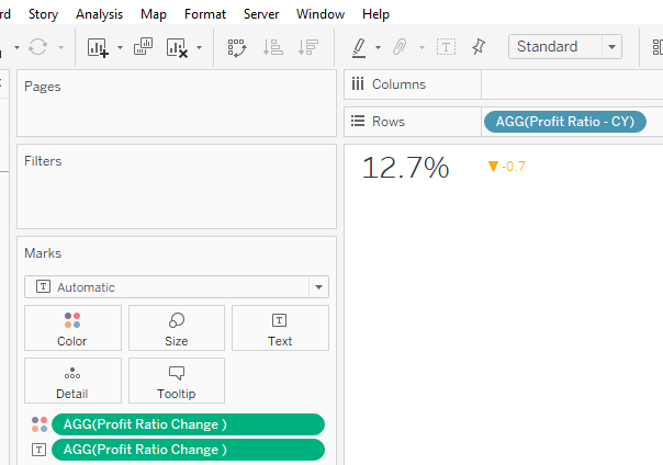
- Replace Profit – CY on rows with Profit Ratio – CY.
- Click on Profit Ratio – CY on the rows shelf and change it to it Discrete.
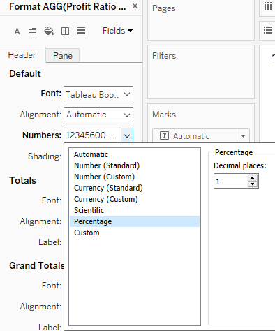
- Click on Profit Ratio – CY once more and change the Format to Tableau Book size 20.
- On the rows shelf click on Profit Ratio CY and choose Format → Numbers → Percentage, Decimal places: 1. It should look like this:

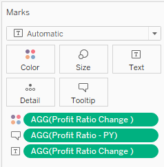
- Replace Profit Change % under the Marks card on Color and on Text with Profit Ratio Change. Your Marks card should look like the below image:

- Change the format of Profit Ratio Change:
- On the Marks card, click on Profit Ratio Change and change Default Format to Percentage Decimal places 1.
- Go to Custom formatting and put in ▲ #,###.0%;▼ -#,###.0%
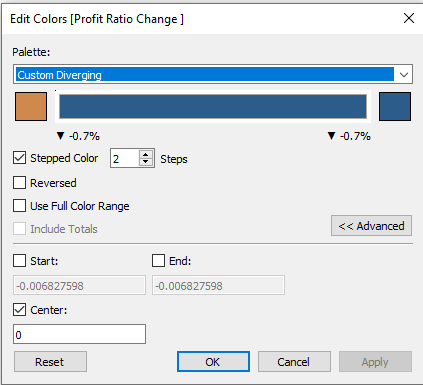
- In the Marks card, click on Colors à Edit Colors to change the colors of Profit Ratio Change as shown below:

Your KPI Profit Ratio worksheet should look like this:

Part IV – build the KPI dashboard
-
- Create a new dashboard and call it Sales KPI Dashboard.
- Under Dashboard change Size from Desktop Browser – Fixed to Automatic.
- Drag over a Horizontal Layout Container.
- Drag over KPI Sales.
- Next to it, drag over KPI Profit.
- Next to that drag over KPI Profit Ratio.
- Click on all three color legends, then click X to remove them from the dashboard.Optional: To ensure your three worksheets are distributed evenly on your dashboard you can use the Distribute Contents Evenly feature available in Layout Containers.
- Click on the white space on the far right and choose Select Layout Container.
- Choose Distribute Contents Evenly (see below):
 After you add a dashboard title, the results should look like this:
 After you add a dashboard title, the results should look like this:
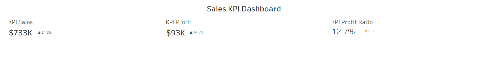
This big numbers dashboard is just the beginning…
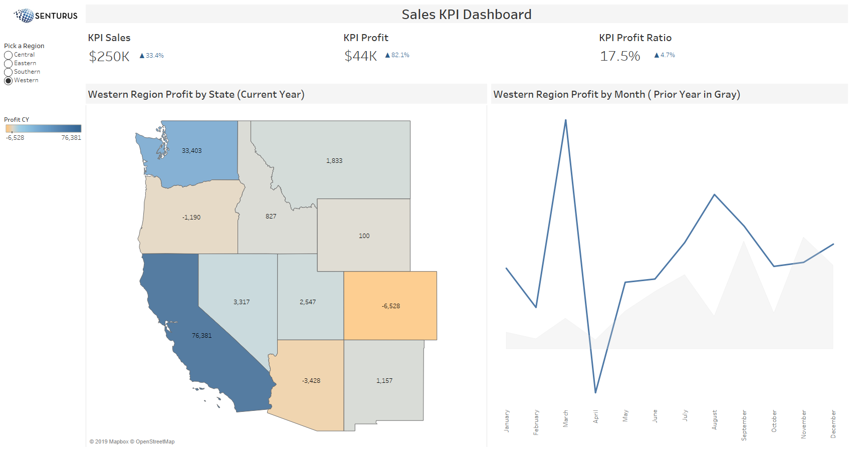
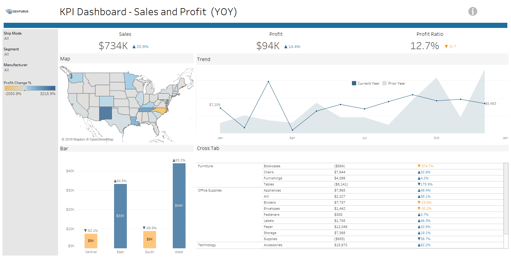
This may seem like a lot of steps to build a dashboard with three KPI numbers but… these fields can be used to build other worksheets. For example, you could build trendline/area chart or a map showing profit by state. Check out the one we built, below. You could also add a parameter for date comparison, asking if users want year-over-year, month-over-month or quarter-over-quarter.
In this example, we show you how to assemble the building blocks. After you have those in place and build the calculated fields correctly, the possibilities for your big numbers dashboards are endless! To get started, you can download the packaged workbook we built for this blog from Tableau Public.
Update: Tableau released a new feature called Metrics (release 2020.2), which is available in Tableau Server and Tableau Mobile. It is not available in Tableau Desktop and cannot be added to a dashboard. Metrics are another way to convey KPIs and, best of all, they can be built in a few clicks and do all the formatting for you! For more information on Tableau Metrics and what they can do, read our blog Lessons & Limitations of Tableau Metrics, the KPI Report Builder.
While we’ve given you the how-to steps, we realize these types of dashboards can be more challenging when not using demo data like Tableau’s Sample Superstore. If you need help applying these concepts to your own data let us know. Or if you’d like to learn more about good dashboard design, check our on-demand webinar Tableau Dashboards that Captivate & Communicate.
At Senturus, our Tableau consulting services help clients successfully transition to a nimble, large-scale application of Tableau that allows them to securely share data. We offer an extensive array of Tableau training courses—both self-paced and instructor led—to take you across the finish line and maximize your ROI.