Simplifying and automating the process of building KPI (key performance indicator) reports. That is the promise of Metrics, the new feature launched in Tableau 2020.2. The arrival of this KPI dashboard builder generated a lot of excitement when it was announced. After all, for a brand known for delivering pretty visualizations, Tableau was a few steps behind when it came to building KPI reports. The process was tedious, a fact made more frustrating when you consider that tools like Microsoft’s Power BI include KPIs as standard visualization type.
If you ever attempted to build a KPI report in previous releases of Tableau, you know it was a many-step process. (See our how-to blog, Creating A Big Numbers KPI Dashboard in Tableau.) To include up and down indicators, nice formatting, period-over-period comparison, or filters for flexibility required using lots of calculated fields and custom formatting.
Tableau Metrics attempts to address that cumbersome process, providing users a consistent, easy way to create KPI reports in mere minutes. So, do Metrics work as promised? Well…sort of.
While the current release has made some great advancements and is quite powerful, it has a few limitations or areas where it falls short of expectations. In this blog, I cover what Tableau Metrics are, how to build them and review a few of the shortcomings.

What are Tableau Metrics?
Tableau Metrics are a new way to build KPI reports, which are used to quickly convey the state of the business. They are meant to provide high level, at-a-glance reporting, showing big numbers at the top so managers and decision makers can quickly see how the business is faring.
Metrics answers a question such as: Are the current sales and profit numbers trending up or down verses last year?
How to build a Tableau Metric
- Go to the view (worksheet) you want to build a Metric from. On the top menu, choose Metrics.
Before you go further, there are a few things to point out:
-
- If your view is a bar chart (such as Sales by State and Year), you will need to build a separate metric for each state ☹.
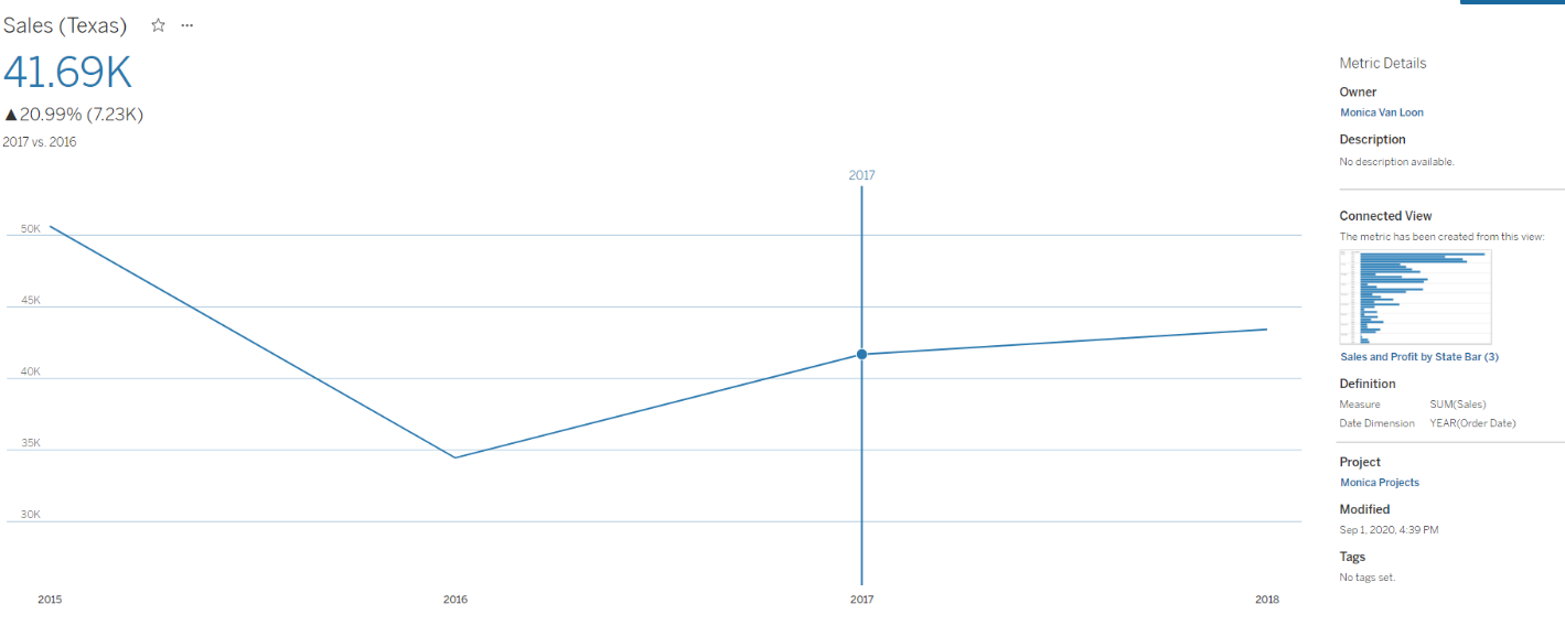
- If your view is a line chart, it only takes the ending value on the line and it will build the metric from that number. See below for an example.
- Notice the automatic up and down arrows for the selected year versus the prior. This new built-in feature is great! Previously, producing up/down arrows in Tableau Desktop and Tableau Server required many steps.

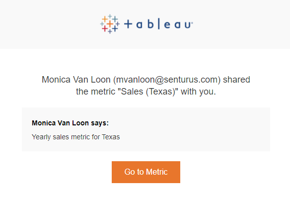
- To share a metric, simply click on the share icon and input your recipient email address(es). They will receive something like the following.

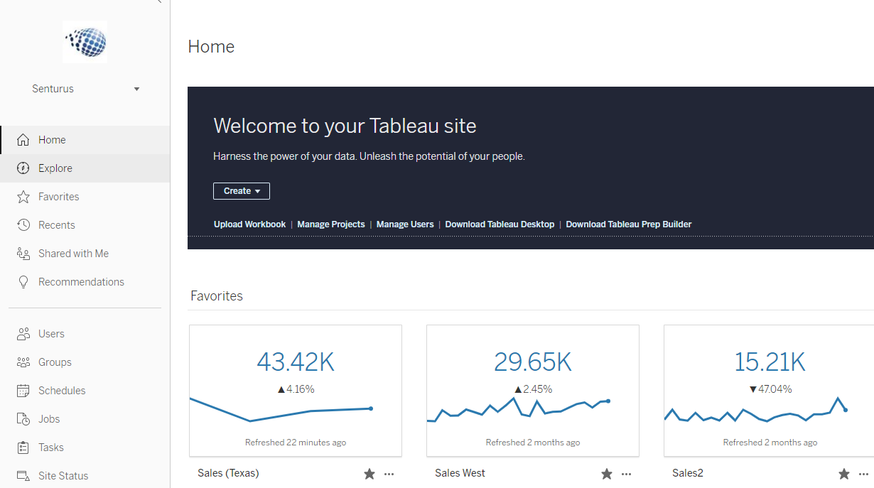
- When your recipient clicks Go to Metric, they will be directed to the Metric on Tableau Server or Tableau Online. They can mark the metric as a favorite so it will show up at the top of their Home page in Tableau Server, Tableau Online or Tableau Mobile.

Shortcomings of Tableau Metrics
Metrics are relatively static. Even though you can set up the data to be refreshed. You cannot change quick filters or parameters within a metric. For example, if you create a “Monthly Sales” metric from a worksheet that has a Region selected in a quick filter, the person viewing the metric has no way of changing the value of the Region. As the feature works today, you need to create a separate metric for each value, which could be cumbersome if you have many values.
Metrics are separate in Tableau content. They cannot be added to dashboards, which are created in Tableau Desktop or Tableau Server. I was hoping Metrics would be a new visualization type in “showme” (available on Tableau Desktop and Tableau Server). That would make them super easy to add to any Big Number or KPI dashboard (which is how KPIs work in Microsoft Power BI).
Metrics are limited when it comes to formatting. What you see is what you get with Metrics. A Tableau Metric is limited to a single number and, if you have a date dimension, a timeline. The timeline feature is dynamic, which is pretty cool. If you move your mouse across a timeline you can see historical values (see the animated phone image below for an example). Unfortunately, if you want to change the colors or fonts of your Metric or add another type of visualization, you will have to build your own Metric dashboard in Tableau Desktop or Tableau Server.
Metrics were developed “mobile first.”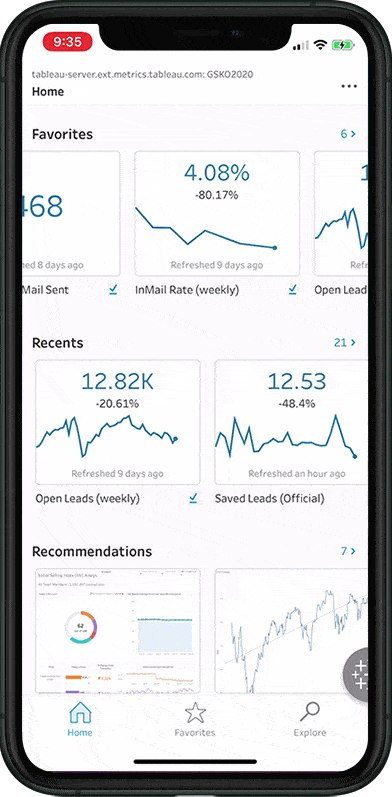 Development priority goes to the mobile app, meaning the coolest features are only available on Tableau Mobile.
Below are two features only available on Tableau Mobile:
- Adjust and compare. This feature provides an easy way to do YOY or MOM comparisons. Turning on show comparison line displays a trend line for the current year plus another trend line showing the same period, the prior year.
- The period for comparison can be adjusted (i.e. previous 12 months to previous 60 months).
You cannot share metrics via Tableau Server subscribe. You can only share via email and unfortunately there is no thumbnail, as there is with Subscriptions. Instead, use the Go To Metric button, which puts you in the Metric in Tableau Server.
Takeaways on Tableau Metrics
Tableau made great strides with its ability to address KPI reports. Especially if you use Tableau Mobile. KPI report building was once a cumbersome process but with Tableau Metrics it has now become streamlined and automated. And, while there are a few shortcomings in the initial release, the components are there to make Metrics a powerful tool going forward.
With Metrics, your decision makers and managers can have key performance indicators at their fingertips, viewing KPI reports on their phones or through a web browser. And the best part is you do not need to be technical or familiar with Tableau Desktop to build Metrics. A few clicks and you have a KPI report ready to be delivered to those who need it.
Hopefully, future releases of Tableau Metrics will see it fully integrated into Tableau Desktop and Tableau Server and they will be enhanced to provide features we have grown accustomed to such as: the ability to create subscriptions, adjust filters and modify date periods.
KPI creation is just one of many differences between Microsoft PowerBI and Tableau. To learn more about how features and functionality in these two popular analytics tools compare and contrast, read our blog Tableau vs. Power BI from a Tableau User’s Perspective.
Metrics are just one way to share important data using Tableau. To learn other ways to share using Tableau, read our blog 6 Ways to Publish & Share Tableau Content. In addition, watch our on-demand webinar 6 Ways to Publish and Share Tableau Dashboards to see demos of Metrics and the five other ways to share data using Tableau.
Learn how to master visualization design and much more with our Tableau training. Whether you’re an analyst or an admin, our Tableau classes are geared to meet the needs of both organizations and individuals and impart practical, real-life skills with Tableau. We offer a range of learning formats from publicly offered and private courses to self-paced learning and mentoring.